Text-to-Graph AI Agent for Analysis & Insights (LLM + Pandas + Plotly + Uber Data) – [Building GenAI Apps #9]
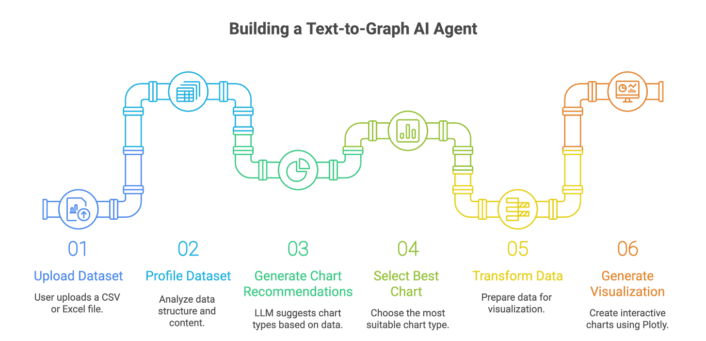
CSV Upload → Ask Question → LLM (Analyze & Profile Data) → Answer (Generate Chart)
TL;DR
This tutorial walks you through building a Text-to-Graph AI Agent that transforms CSV data into insightful visualizations based on natural language queries.
You’ll learn how to leverage OpenAI’s structured outputs with Pydantic for consistent results, use the OpenAI Files API for seamless data uploads, employ Pandas for robust data analysis, and create stunning charts with Plotly.
Using the Uber Ride Analytics Dataset (148,770 records), we’ll build an agent that answers questions like
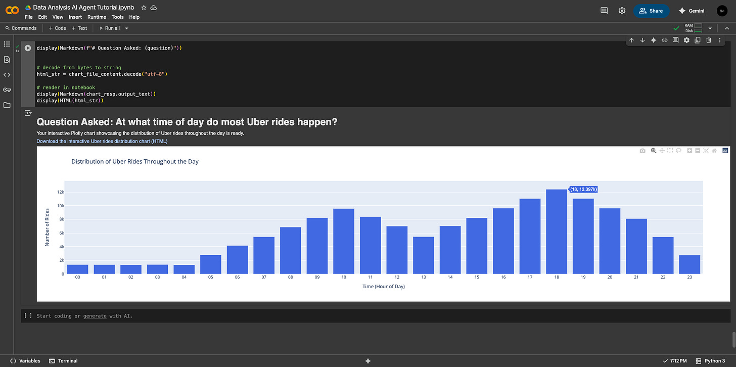
“At what time of day do most Uber rides happen?”by profiling data, recommending charts, and generating visualizations.
The ability to transform raw data into actionable insights is a crucial skill for businesses, researchers, and analysts. As Generative AI continues to reshape workflows, its integration with data storytelling provides incredible opportunities to develop intelligent analytical agents capable of automating complex data mining tasks.
One such application is a Text-to-Graph AI Agent, a tool that takes structured data, such as a CSV file, processes user queries in natural language, performs sophisticated data analysis, and generates insightful visualizations.
By the end of this tutorial, you’ll understand how to create a trusted, professional-grade tool that provides reliable insights and avoids common pitfalls like AI hallucinations.
Let’s get started.
Understanding Generative AI Agents
An AI agent is a software system that integrates artificial intelligence, usually a large language model (LLM), with external tools and data sources to perform tasks either autonomously or semi-autonomously.
For non-technical readers, imagine an AI agent as a competent intern who can read a spreadsheet, analyze its contents, and create a chart to answer your question—all while explaining their reasoning.
For developers, an AI agent is a pipeline that integrates an LLM’s natural language understanding with programmatic tools to achieve specific objectives, such as data analysis or visualization.
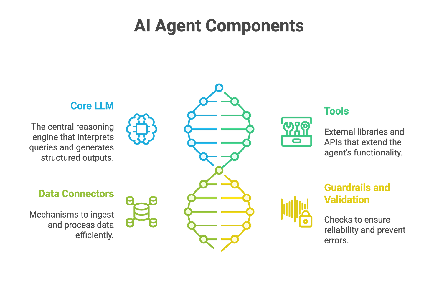
Key Components of an AI Agent
To build a Text-to-Graph AI Agent, we need to understand its core components, which work together to process data and deliver insights:
Core LLM (Reasoning Engine): The LLM, such as OpenAI’s GPT (Google’s Gemini or XAI’s Grok), serves as the brain of the agent. It interprets natural language queries, reasons about the data, and generates structured outputs (e.g., chart recommendations or Pandas queries). Its ability to understand context and make decisions is central to the agent’s intelligence.
Tools (External Capabilities): The agent relies on external libraries and APIs to extend its functionality. In our case, Pandas handles data manipulation, Plotly creates visualizations, and OpenAI’s Files API and code interpreter enable file processing and code execution.
Data Connectors: These are mechanisms to ingest and process data, such as reading CSV files into a Pandas DataFrame or uploading files to OpenAI’s API. They ensure the agent can access and manipulate structured data efficiently.
Guardrails and Validation: To ensure reliability, the agent incorporates checks at each step (e.g., validating Pandas queries or chart configurations) to prevent errors or hallucinations, aligning with the Trust-After-Verification principle.
These components work in harmony to transform a user’s question into a visual answer, making the agent both powerful and user-friendly.
Use Cases for AI Agents
Before we dive into the code, let’s look at how AI agents are transforming industries by automating complex tasks, increasing productivity, and lowering costs. Here are a few examples to show their value:
Customer Support Assistant: An AI agent can handle customer inquiries, schedule meetings, and create support tickets, reducing response times and improving customer satisfaction. For instance, a retail business could use such an agent to streamline customer interactions, saving hours of manual work.
Voice Call Agent: As explored in a previous Building GenAI article, a voice-enabled agent can conduct phone conversations, answer queries, and log interactions, offering a scalable solution for call centers.
Text-to-Graph AI Agent (Our Focus): This agent enables users to upload a dataset (e.g., a CSV file of Uber ride data) and ask questions in plain language. The agent analyzes the data, selects the most appropriate chart, and generates a visualization.
The Text-to-Graph AI Agent is particularly valuable because it democratizes data analysis. A small business owner can identify sales trends, a researcher can visualize experimental results, and an analyst can monitor KPIs—all without needing a data science degree. By automating EDA, statistical analysis, and visualization, the agent saves time, reduces errors, and delivers actionable insights.
Architecture of the Text-to-Graph AI Agent
Our goal is to build an AI agent that takes a CSV file, processes a user’s natural language query, and generates a chart that provides the best possible insight. The agent’s key features include:
Data Ingestion and Profiling: Automatically load and analyze a CSV file to understand its structure, data types, missing values, and statistical properties.
Query Understanding: Interpret the user’s question (e.g., “At what time of day do most Uber rides happen?”) and map it to relevant data operations.
Data Transformation: Perform filtering, aggregation, and cleaning to prepare the data for visualization.
Chart Recommendation and Generation: Suggest the most suitable chart type (e.g., bar, line, histogram) and generate it using Plotly, ensuring the visualization is clear and insightful.
Trustworthiness: Implement guardrails to validate each step, ensuring the agent’s outputs are accurate and reliable.
The pipeline involves several key processes:
Exploratory Data Analysis (EDA): Summarize the dataset’s structure, identify missing values, and compute statistics (e.g., mean, median, correlations).
Data Transformation: Filter and aggregate data based on the query (e.g., grouping rides by hour of the day).
Chart Selection: Use the LLM to recommend chart types based on data characteristics and the query, such as histograms for distributions or bar charts for categorical comparisons.
Visualization Generation: Execute Plotly code to create interactive charts that can be viewed or downloaded as HTML files.
The tools and libraries we’ll use include:
OpenAI’s Structured Output with Pydantic: Ensures consistent, machine-readable chart recommendations (see previous article for details).
OpenAI Files API: Handles CSV uploads for seamless data processing.
OpenAI Code Interpreter: Executes Python code to transform data and generate charts.
Pandas: Powers data manipulation, filtering, and aggregation.
Plotly: Creates interactive, publication-quality visualizations.
Hands-On Tutorial: Building the Text-to-Graph AI Agent
Let’s dive into the practical steps to build our Text-to-Graph AI Agent using the Uber Ride Analytics Dataset for 2024.
This dataset contains 148,770 bookings, including metrics on ride completion (93K completed, 65.96% success rate), cancellations (37.43K, 25%), customer behavior, vehicle performance, revenue, and satisfaction.
Our agent will answer questions like “At what time of day do most Uber rides happen?” by generating the most appropriate graph visualization which provides required insights.
Enforcing AI Trustworthiness: Trust-After-Verification (TAV) Principle
According to the Trust-After-Verification (TAV) principle, the overall solution presented by an AI agent can only be trusted if it earns trust by delivering accurate answers to each sub-problem that constitutes the larger task.
— Samuel N. Theophilus (Introducing the TAV Concept)
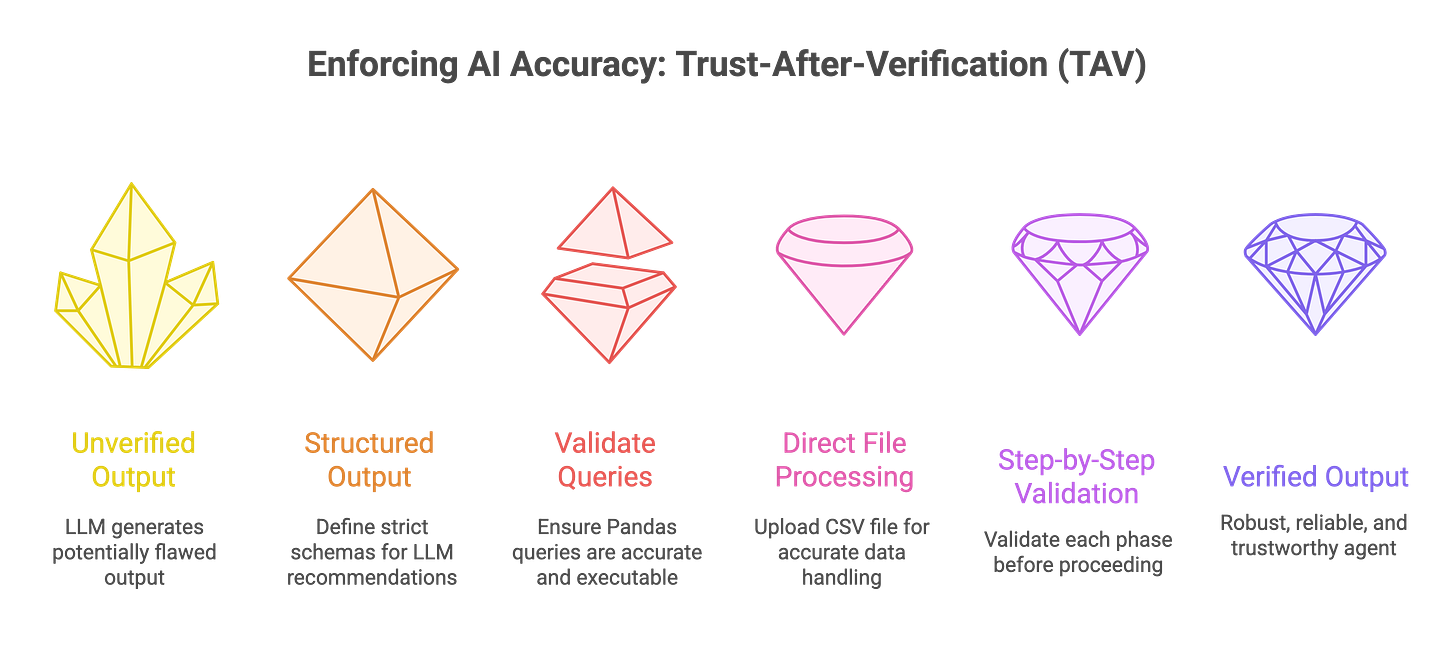
To make our agent reliable, we are adopting the Trust-After-Verification (TAV) principle. TAV assumes that the LLM’s outputs may contain errors or hallucinations and validates each step before proceeding.
This is critical because LLMs can sometimes misinterpret data, generate incorrect code, or propose unsuitable visualizations. TAV breaks the pipeline into verifiable chunks, ensuring each step (e.g., data profiling, query generation, chart creation) is correct before moving forward.
Here’s how we implement TAV:
Structured Outputs with Pydantic: We define strict schemas (e.g.,
ChartPlan,ChosenChart) to ensure the LLM’s chart recommendations are consistent and include critical details like column names, chart types, and Pandas queries. This reduces ambiguity and makes outputs machine-readable.Validated Pandas Queries: The LLM generates a Pandas
df.query(...)string to filter the dataset. If the query fails (e.g., due to incorrect column names), it indicates the LLM misunderstood the data, and we can halt or prompt for clarification.Direct File Processing: Instead of relying on textual reasoning (e.g., passing CSV content as a string), we upload the CSV file to OpenAI’s Files API and use the code interpreter to process it directly. This ensures accurate data handling and reduces errors from misinterpreting file formats.
Step-by-Step Validation: Each phase—data profiling, query execution, data transformation, and chart generation—is validated before proceeding. For example, if the LLM’s query produces an empty DataFrame, we flag it as an error and investigate rather than trusting the output blindly.
This approach ensures our agent is robust, reliable, and capable of handling real-world datasets without producing misleading results.
Step-by-Step Implementation
This code is designed to run in a Google Colab notebook, but the concepts apply to any Python environment.
We’ll use the Uber dataset and the question “At what time of day do most Uber rides happen?” as our example.
1. Setting Up Dependencies and Imports
We begin by installing and importing the necessary libraries. These include:
OpenAI’s Python client for API interactions,
Pandas for data manipulation,
Plotly for visualization, and
Pydantic for structured outputs.
We also configure the OpenAI API key securely using environment variables or Colab’s secrets management (see this article for introductory guide).
Install dependencies
!pip install --upgrade openai pandas plotly "plotly[kaleido]" openpyxl python-dotenvImport Libaries
import os, io, json, base64, requests, re
import pandas as pd
import numpy as np
import plotly.express as px
from IPython.display import display, Image, HTML, Markdown
from google.colab import files as colab_files
from google.colab import userdata
import openai
from typing import List, Optional, Dict, Any
from pydantic import BaseModel, Field, ValidationError, model_validator
from typing_extensions import Literal

# Configure OpenAI API key (use Colab secrets or environment variables)
OPENAI_API_KEY = userdata.get('OPENAI_API_KEY')

client = openai.OpenAI(api_key=OPENAI_API_KEY)

if not OPENAI_API_KEY:
    print("Warning: OPENAI_API_KEY not found. Set it before proceeding.")
2. Profiling the Dataset
The profile_dataframe function analyzes the CSV file to create a comprehensive summary of its structure and contents. This profile includes the dataset’s shape, column data types, missing values, unique values, descriptive statistics, correlations, and cleaning suggestions.
The profile is critical because it provides the LLM with context to understand the data and make informed chart recommendations.
def profile_dataframe(df: pd.DataFrame) -> dict:
    """
    Profile a DataFrame with summary statistics, dtype info, missing values,
    unique counts, and basic cleaning checks.

    Returns a dictionary of profiling results.
    """

    profile = {}

    try:
        # Sample data
        profile["sample_data"]=df.head(3).to_dict()
        # Shape of data
        profile["shape"] = {"rows": df.shape[0], "columns": df.shape[1]}

        # Column data types
        dtypes = df.dtypes.astype(str).to_dict()
        profile["dtypes"] = dtypes

        # Missing values per column
        missing = df.isnull().sum().to_dict()
        profile["missing_values"] = missing

        # % Missing values
        missing_pct = (df.isnull().sum() / len(df) * 100).round(2).to_dict()
        profile["missing_percentage"] = missing_pct

        # Unique values per column
        unique_counts = df.nunique(dropna=False).to_dict()
        profile["unique_counts"] = unique_counts

        # Sample unique values for categorical (string) columns
        categorical_samples = {}
        for col in df.select_dtypes(include=["object", "category"]).columns:
            samples = df[col].dropna().unique()[:5]  # get first 5 unique values
            categorical_samples[col] = samples.tolist()

        profile["categorical_samples"] = categorical_samples

        # Descriptive statistics (numeric + categorical)
        try:
            desc_numeric = df.describe(include=[np.number], datetime_is_numeric=True).to_dict()
        except Exception:
            desc_numeric = {}
        try:
            desc_categorical = df.describe(include=[object, "category"]).to_dict()
        except Exception:
            desc_categorical = {}

        profile["describe_numeric"] = desc_numeric
        profile["describe_categorical"] = desc_categorical

        # Memory usage
        buffer =df.info()
        profile["info"] = "\n".join(map(str, buffer))

        # Correlations (only numeric columns)
        try:
            corr = df.corr(numeric_only=True).to_dict()
        except Exception:
            corr = {}
        profile["correlations"] = corr

        # Basic cleaning checks
        cleaning_suggestions = []
        for col in df.columns:
            if df[col].dtype == object:
                if df[col].str.strip().duplicated().any():
                    cleaning_suggestions.append(f"Column '{col}' may have duplicate string entries with extra spaces.")
            if df[col].isnull().sum() > 0:
                cleaning_suggestions.append(f"Column '{col}' has {df[col].isnull().sum()} missing values.")
        profile["cleaning_suggestions"] = cleaning_suggestions

    except Exception as e:
        profile["error"] = f"Failed to profile DataFrame: {str(e)}"

    return profile
For the Uber dataset, this function might reveal that the dataset has columns like ride_time (datetime), fare (numeric), and vehicle_type (categorical), with, say, 5% missing values in fare. This information helps the LLM understand the data’s structure and propose relevant charts.
3. Uploading and Loading the Dataset
We use a helper function to upload the CSV file and load it into a Pandas DataFrame. This step ensures seamless data ingestion, whether the file is a CSV or Excel.
def upload_and_read():
    print("Choose file(s) to upload (CSV or Excel).")
    uploaded = colab_files.upload()
    if not uploaded:
        raise RuntimeError("No file uploaded.")
    fname = list(uploaded.keys())[0]
    print("Uploaded:", fname)
    if fname.lower().endswith((".xls", ".xlsx")):
        df = pd.read_excel(io.BytesIO(uploaded[fname]))
    else:
        df = pd.read_csv(io.BytesIO(uploaded[fname]))
    print("Shape:", df.shape)
    return df, fname

df, fname = upload_and_read()
profile = profile_dataframe(df)
For our example, we upload the Uber dataset, which contains 148,770 rows and columns like ride_time, fare, and status.
4. Defining Structured Outputs with Pydantic
To ensure the LLM’s chart recommendations are consistent and actionable, we define Pydantic models to structure the output. These models include configurations for axes, chart candidates, and the final chosen chart, complete with a Pandas query string.
class XAxisConfig(BaseModel):
    type: Literal["numeric", "categorical", "datetime"]
    label: Optional[str]
    format: Optional[str]
    granularity: Optional[Literal["hour", "day", "week", "month", "quarter", "year"]]
    tick_format: Optional[str]
    scale: Optional[Literal["linear", "log", "sqrt"]]
    order: Optional[List[str]]
    top_k: Optional[int]
    range: Optional[List[float]]
    model_config = {"extra": "forbid"}

class YAxisConfig(BaseModel):
    type: Literal["numeric", "categorical"]
    label: Optional[str]
    scale: Optional[Literal["linear", "log", "sqrt"]]
    format: Optional[str]
    aggregate_hint: Optional[Literal["sum", "mean", "count", "median", "min", "max"]]
    range: Optional[List[float]]
    model_config = {"extra": "forbid"}

class ChartCandidate(BaseModel):
    chart_type: str
    reasoning: str
    score: float

class ChartConfig(BaseModel):
    title: Optional[str]
    x_axis: Optional[XAxisConfig]
    y_axis: Optional[YAxisConfig]
    legend: Optional[bool]

class ChosenChart(BaseModel):
    chart_type: str
    x: str
    y: List[str]
    aggregate: Optional[str]
    group_by: Optional[str]
    filters: List[str]
    chart_config: Optional[ChartConfig]
    query: str

class ChartPlan(BaseModel):
    question: str
    chart_candidates: List[ChartCandidate]
    chosen: ChosenChart
These schemas ensure the LLM’s output is structured as JSON, specifying the chart type, axes, aggregation, and a valid Pandas query.
For example, for the question “At what time of day do most Uber rides happen?”, the LLM might propose a histogram with ride_time (hourly granularity) on the x-axis and count on the y-axis.
5. Generating Chart Recommendations
The ask_model_for_chart function sends the user’s question and dataset profile to the LLM, which returns a structured ChartPlan.
The LLM uses heuristics (e.g., time-series → line chart, distributions → histogram) to recommend up to three chart candidates and select the best one.
def ask_model_for_chart(question, profile, model="gpt-4o-mini"):
    messages = [
        {"role": "system", "content": (
            "You are a data-visualization assistant. Propose up to 3 chart candidates with reasons and scores (0-1). "
            "Choose the best chart and return a JSON matching the `ChartPlan` schema. "
            "Use heuristics: time-series -> line, compare by category -> bar/stacked, distribution -> histogram/box, "
            "relationship -> scatter. Generate a valid pandas `df.query(...)` string."
        )},
        {"role": "user", "content": json.dumps({"question": question, "profile": profile})}
    ]
    resp = client.chat.completions.parse(
        model="gpt-4o-2024-08-06",
        messages=messages,
        response_format=ChartPlan
    )
    return resp
For our example question, the LLM might propose:
A histogram (
score: 0.9) to show ride frequency by hour.A bar chart (
score: 0.8) to compare rides across time buckets.A line chart (
score: 0.7) for time-series trends. It selects the histogram and generates a query likedf.query("`Time` != ''").
# Result of Chosen Graph Visualization

{'question': 'At what time of day do most Uber rides happen?',
 'chart_candidates': [{'chart_type': 'bar',
   'reasoning': 'A bar chart is suitable for comparing the frequency of rides at different times of day by categorizing the times into predefined intervals or buckets.',
   'score': 0.8},
  {'chart_type': 'histogram',
   'reasoning': 'A histogram is a good choice for showing the distribution of ride counts across different time buckets, as it helps in visualizing peaks in ride frequency over time intervals.',
   'score': 0.9},
  {'chart_type': 'line',
   'reasoning': "A line chart can be used if we convert the 'Time' column into hours and show the trend of rides throughout the day. However, it's less intuitive for time frequency comparison than a histogram.",
   'score': 0.7}],
 'chosen': {'chart_type': 'histogram',
  'x': 'Time',
  'y': [],
  'aggregate': None,
  'group_by': None,
  'filters': [],
  'chart_config': {'title': 'Distribution of Uber Rides Throughout the Day',
   'x_axis': {'type': 'categorical',
    'label': 'Time',
    'format': '%H',
    'granularity': None,
    'tick_format': None,
    'scale': None,
    'order': None,
    'top_k': None,
    'range': None},
   'y_axis': {'type': 'numeric',
    'label': 'Number of Rides',
    'scale': 'linear',
    'format': None,
    'aggregate_hint': 'count',
    'range': None},
   'legend': None},
  'query': "`Time` != ''"}}
6. Uploading and Transforming Data
We upload the filtered DataFrame to OpenAI’s Files API and use the code interpreter to transform it based on the LLM’s recommendations. This step ensures the data is ready for plotting.
def upload_file_to_openai(file_buffer, file_name: str, expire_seconds: int = 3600):
    file_like = io.BytesIO(file_buffer.getvalue().encode("utf-8"))
    file_like.name = file_name
    openai_file = client.files.create(
        file=file_like,
        purpose="user_data",
        expires_after={"anchor": "created_at", "seconds": expire_seconds}
    )
    return openai_file

csv_buffer = io.StringIO()
df.to_csv(csv_buffer, index=False)
csv_buffer.seek(0)
openai_file = upload_file_to_openai(csv_buffer, "filtered_uber_data.csv")
The code interpreter processes the file, applying aggregations or filters as specified (e.g., grouping rides by hour).
7. Generating the Plotly Chart
Finally, we use the code interpreter to generate a Plotly chart based on the transformed data and chart specifications. The output is an interactive HTML file that can be downloaded and viewed.
chart_input = f"""
You are given a filtered dataset in CSV format, a user question, and chart specifications.
Use the dataset to generate a chart (with Plotly) that best answers the question.
User Question: {question}
Chosen Chart Spec: {llm_chart_options['chosen']}
Output:
- Use Plotly in Python to generate the chart.
- Save the chart as an interactive HTML file using Plotly's `fig.write_html()`.
"""

chart_resp = client.responses.create(
    model="gpt-4.1",
    tools=[{"type": "code_interpreter", "container": {"type": "auto", "file_ids": [openai_chart_file.id]}}],
    instructions=chart_input,
    input="Generate a Plotly chart as an HTML export."
)
The resulting chart, a histogram of Uber ride frequency by hour, is displayed in the notebook and downloadable as an HTML file.
Conclusion
Building a Text-to-Graph AI Agent empowers users to extract insights from structured data with ease, combining the power of LLMs with robust data processing and visualization tools.By leveraging OpenAI’s structured outputs, Files API, Pandas, and Plotly, we created an agent that answers natural language queries with accurate, insightful charts.
The Trust-After-Verification approach ensures reliability, making this tool suitable for business owners, researchers, and analysts. Whether optimizing Uber’s driver schedules or analyzing sales trends, this agent demonstrates the potential of GenAI to democratize data analysis.
Try it with your own dataset and explore the possibilities!


Great to read from you again