
Streamlit: Step-by-Step Guide to Build an Interactive Dashboard with Streaming Data (Spotify & Apple Music)

With Streamlit, you no longer have to struggle navigating web apps’ front-end framework jungle or wrestle with HTML, CSS, and JavaScript to showcase your exceptional AI solutions and insights. The Streamlit Python Library frees you from the tedious learning curve—time that was previously spent mastering web frameworks can now be spent advancing your AI experiments, allowing your algorithms to shine without the hassle of web development.
In this tutorial, we’re going from zero to intermediate, building a music streaming dashboard that pulls real Spotify and Apple Music data into a visual masterpiece. Whether you’re a Decision Maker hunting for insights or a Data Enthusiast craving a creative flex, Streamlit’s got your back.
What is Streamlit, and why does it matter?
Streamlit is an open-source Python framework designed to streamline the creation of interactive web applications, specifically tailored for analytics, data science, machine learning, and AI workflows.

At its core, Streamlit enables developers to build and deploy data-driven apps using pure Python, thereby bypassing the complexities of traditional web development stacks, such as HTML, CSS, and JavaScript. With a simple API, it converts scripts into responsive interfaces, rendering charts, tables, and widgets in real-time as users interact with the data.
Key Features and Technical Strengths
Rapid Prototyping: Streamlit’s declarative syntax enables quick app development. A single Python file can define both the logic and the user interface, reducing setup time from days to minutes.
Real-Time Interactivity: Built-in widgets, such as sliders, buttons, and text inputs, dynamically update outputs, making it ideal for testing AI models or visualizing data in real-time.
Integration with Data Libraries: It seamlessly integrates with libraries such as Pandas, NumPy, Matplotlib, and Plotly, allowing developers to leverage existing data processing and visualization tools without additional overhead.
Caching Mechanism: The
@st.cache_datadecorator optimizes performance by storing expensive computations, ensuring apps run efficiently even with large datasets.Customizability: Developers can enhance apps with CSS via
st.markdownand deploy them locally or on cloud platforms, offering flexibility for production use.
Getting Started: Your First Streamlit App
Let’s begin with a simple app to demonstrate Streamlit’s ease of use. This example will walk you through installation, setup, and your first interactive application.

Installation and Setup
Open your terminal and install Streamlit:
pip install streamlitVerify the installation:
streamlit --versionCreate a file named hello_world.py and add the following code:
import streamlit as st

# Set the page configuration
st.set_page_config(page_title="Hello World App", layout="centered")

# Display the title
st.title("Hello, Streamlit World!")

# Add a header and some text
st.header("Welcome to Your First Streamlit App")
st.write("This example introduces you to Streamlit’s core features.")

# Interactive button
if st.button("Click Me"):
    st.success("Button clicked successfully!")

# User input
name = st.text_input("What’s your name?")
if name:
    st.write(f"Hello, {name}! Nice to meet you.")

# Slider for interactivity
age = st.slider("Select your age:", 1, 100)
st.write(f"You’re {age} years old.")
Run the app:
streamlit run hello_world.pyA browser window will open, revealing your app. Click the button, enter your name, and adjust the slider—Streamlit makes it interactive with minimal effort. This simplicity is what makes it a powerful tool for rapid development.
Building a Basic Dashboard
Now that you’re familiar with Streamlit’s basics, let’s create a simple dashboard to showcase its potential for data visualization and interactivity.

Save this as basic_dashboard.py:
import streamlit as st
import pandas as pd
import numpy as np
import matplotlib.pyplot as plt

# Page setup
st.set_page_config(page_title="Basic Streamlit Dashboard", layout="centered")
st.title("Basic Streamlit Dashboard")
st.write("A straightforward dashboard to explore Streamlit’s capabilities.")

# Generate sample data
@st.cache_data
def generate_data(rows=100):
    np.random.seed(42)
    data = {
        'Category': np.random.choice(['A', 'B', 'C'], size=rows),
        'Value': np.random.randint(1, 100, size=rows),
        'Score': np.random.randn(rows) * 15 + 50
    }
    return pd.DataFrame(data)

df = generate_data()

# Sidebar filters
st.sidebar.header("Filters")
category_filter = st.sidebar.multiselect("Select Category:", options=df['Category'].unique(), default=df['Category'].unique())
value_filter = st.sidebar.slider("Minimum Value:", min_value=0, max_value=100, value=0)

# Apply filters
filtered_df = df[(df['Category'].isin(category_filter)) & (df['Value'] >= value_filter)]

# Display data
st.write("### Filtered Data")
st.dataframe(filtered_df)

# Visualizations
st.write("### Category Distribution")
fig, ax = plt.subplots()
filtered_df['Category'].value_counts().plot(kind='bar', color=['#4CAF50', '#FFC107', '#2196F3'], ax=ax)
ax.set_xlabel('Category')
ax.set_ylabel('Count')
ax.set_title('Distribution of Categories')
st.pyplot(fig)

st.write("### Score Trends")
st.line_chart(filtered_df[['Score']])
This dashboard enables users to filter and visualize data through a bar chart and a line chart. For developers, it demonstrates how Streamlit integrates with libraries such as Pandas and Matplotlib. For business users, it shows how quickly you can transform data into a shareable tool—no front-end skills required.
Interactive Dashboards with Plotly
To take your dashboards to the next level, let’s introduce Plotly, a library known for its interactive and visually appealing charts. Plotly integrates seamlessly with Streamlit, allowing users to zoom, hover, and explore data dynamically.
It’s an excellent choice for creating professional-grade visualizations that can impress stakeholders or enhance your AI project demos.
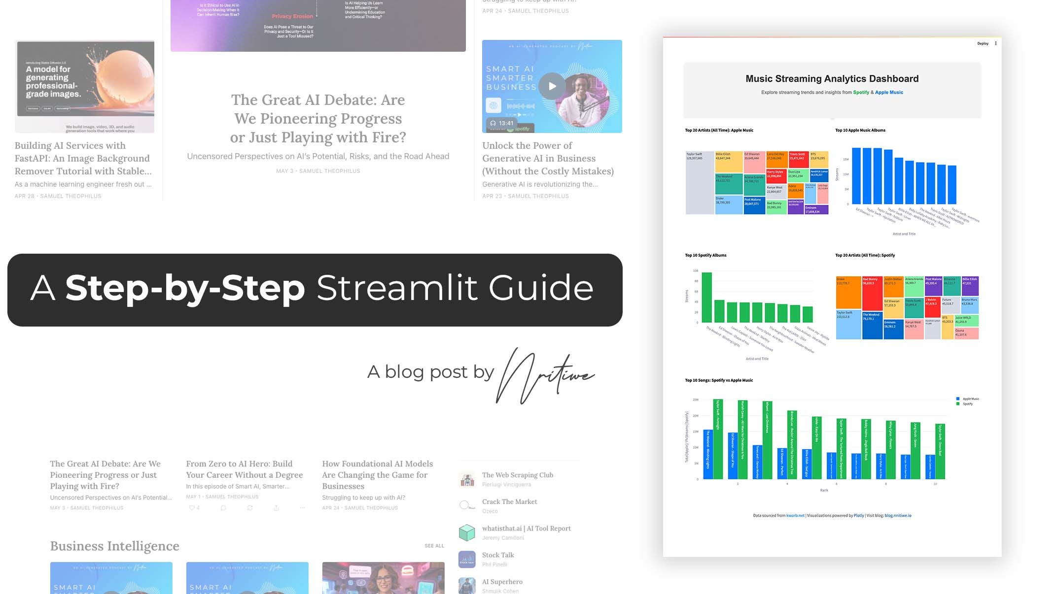
An Advanced Example: Music Streaming Dashboard
As a practical example, let’s explore how Streamlit can be used to build a dashboard with real-world data. We’ll pull music streaming stats from kworb.net, a site that aggregates data from platforms like Spotify and Apple Music, and create an interactive dashboard.

Save this as music_dashboard.py:
import streamlit as st
import pandas as pd
import plotly.express as px
import plotly.graph_objects as go
from urllib.error import URLError

# Page setup
st.set_page_config(page_title="Music Streaming Analytics Dashboard", layout="wide")

# Header
st.markdown("""
<div style="text-align: center; padding: 20px; background-color: #F4F4F4; border-radius: 10px;">
    <h1 style="color: #333;">Music Streaming Analytics Dashboard</h1>
    <p style="color: #666;">Explore trends from
    <a href="https://kworb.net" target="_blank" style="color: #1DB954;">Spotify</a> &
    <a href="https://kworb.net" target="_blank" style="color: #007AFF;">Apple Music</a></p>
</div>
""", unsafe_allow_html=True)

# Data loading
@st.cache_data
def load_data(url, table_index=0):
    try:
        return pd.read_html(url)[table_index]
    except URLError:
        st.error("Failed to load data from the URL.")
        return pd.DataFrame()

# Data cleaning
def clean_data(df, column_name):
    if not df.empty:
        df["Streams"] = pd.to_numeric(df[column_name], errors="coerce")
    return df

# Visualization functions
def plot_treemap(df, title):
    fig = px.treemap(df.head(20), path=["Artist"], values='Streams', title=title)
    st.plotly_chart(fig, use_container_width=True)

def plot_bar_chart(df, x_col, y_col, title, color):
    fig = px.bar(df.head(10), x=x_col, y=y_col, title=title, color_discrete_sequence=[color])
    st.plotly_chart(fig, use_container_width=True)

def plot_comparison_chart(apple_songs, spotify_songs):
    fig = go.Figure()
    fig.add_trace(go.Bar(x=apple_songs['Rank'], y=apple_songs['Streams'], name='Apple Music', marker_color='#007AFF'))
    fig.add_trace(go.Bar(x=spotify_songs['Rank'], y=spotify_songs['Streams'], name='Spotify', marker_color='#1DB954'))
    fig.update_layout(title="Top Songs: Spotify vs Apple Music", barmode='group')
    st.plotly_chart(fig, use_container_width=True)

# Load and clean data
spotify_artists = clean_data(load_data("https://kworb.net/spotify/artists.html"), "Streams")
apple_albums = clean_data(load_data("https://kworb.net/apple_albums/totals.html"), "Total")
spotify_songs = clean_data(load_data("https://kworb.net/spotify/country/global_daily_totals.html"), "PkStreams")

# Layout and visualizations
col1, col2 = st.columns(2)
with col1:
    if not spotify_artists.empty:
        plot_treemap(spotify_artists, "Spotify’s Top Artists")
with col2:
    if not apple_albums.empty:
        plot_bar_chart(apple_albums, "Artist and Title", "Streams", "Apple Music’s Top Albums", "#007AFF")

if not spotify_songs.empty:
    spotify_top = spotify_songs.sort_values("Streams", ascending=False).head(10)
    apple_top = apple_albums.sort_values("Streams", ascending=False).head(10)
    spotify_top['Rank'] = range(1, 11)
    apple_top['Rank'] = range(1, 11)
    plot_comparison_chart(apple_top, spotify_top)
This advanced example demonstrates how Streamlit, combined with Pandas and Plotly, can create a professional dashboard. It’s a glimpse into the kind of tools you can build to explore real-world data, whether for business insights or technical projects.
Next Steps
Streamlit empowers you to create and share data-driven applications with ease. Explore the live dashboard at HuggingFace Spaces (note: the app may be slow due to free resource limitations and real-time data load). To host your own Streamlit apps for free, check out my guide on deploying apps on HuggingFace—a Streamlit-specific tutorial is coming soon.
You can find the complete code for this tutorial on GitHub at Codelab 3.